Essential UI/UX Principles for Modern Web Design

Table of Contents
Introduction
User Interface (UI) and User Experience (UX) design are the cornerstones of successful web development in 2025. While trends come and go, fundamental principles remain constant. Understanding these core concepts is essential for creating websites that not only look beautiful but also function flawlessly across all devices and user needs.
In this comprehensive guide, we'll explore the essential UI/UX principles that every web designer should master. Whether you're a beginner looking to build a strong foundation or an experienced designer wanting to refresh your knowledge, these principles will help you create more effective, user-centered designs.
Core UI/UX Principles
1. User-Centered Design
The most fundamental principle of UI/UX design is putting users first. Every design decision should be made with the end-user in mind. This means understanding your target audience, their needs, goals, and pain points.
Key aspects of user-centered design:
- User Research: Conduct interviews, surveys, and usability testing
- Personas: Create detailed user profiles to guide design decisions
- User Journeys: Map out how users interact with your website
- Pain Point Analysis: Identify and solve user frustrations
2. Clarity and Simplicity
In 2025, users expect interfaces to be intuitive and straightforward. Complex designs often lead to confusion and high bounce rates. The principle of clarity means users should understand what to do without extensive instructions.
Implementation tips:
- Use clear, descriptive labels for buttons and links
- Minimize cognitive load by reducing choices
- Employ progressive disclosure for complex information
- Use familiar patterns and conventions
- Provide clear feedback for user actions
3. Visual Hierarchy
Visual hierarchy guides users through your content, helping them understand what's most important. This principle ensures users can quickly scan and find the information they need.
Elements of visual hierarchy:
- Size: Larger elements appear more important
- Color: Bright colors draw attention to key elements
- Contrast: High contrast improves readability and focus
- Spacing: White space creates visual separation
- Typography: Font size and weight establish importance
Visual Hierarchy in Practice
Creating effective visual hierarchy requires understanding how users scan web pages. Research shows users typically follow F-shaped or Z-shaped reading patterns. Design your layouts to accommodate these natural scanning behaviors.
Best practices for visual hierarchy:
- Headline Structure: Use H1-H6 tags semantically
- Color Coding: Use color consistently for similar elements
- Size Scaling: Make important elements larger
- Strategic Placement: Position key elements in high-visibility areas
- Grouping: Related items should be visually grouped
Consistency and Standards
Consistency creates familiarity and reduces cognitive load. When users know what to expect, they can navigate your site more efficiently. This applies to both internal consistency within your site and external consistency with web standards.
Types of consistency:
- Visual Consistency: Consistent colors, fonts, and spacing
- Functional Consistency: Similar elements work the same way
- Internal Consistency: Patterns repeated throughout your site
- External Consistency: Following web conventions and standards
Accessibility First
Accessibility is no longer optional in 2025—it's essential. Designing for accessibility means ensuring your website can be used by people with disabilities. This not only expands your audience but also improves overall user experience.
Key accessibility principles:
- Keyboard Navigation: All functionality accessible via keyboard
- Screen Reader Support: Proper semantic HTML and ARIA labels
- Color Contrast: WCAG AA or AAA contrast ratios
- Text Alternatives: Alt text for images and transcripts for video
- Focus Management: Clear focus indicators and logical tab order
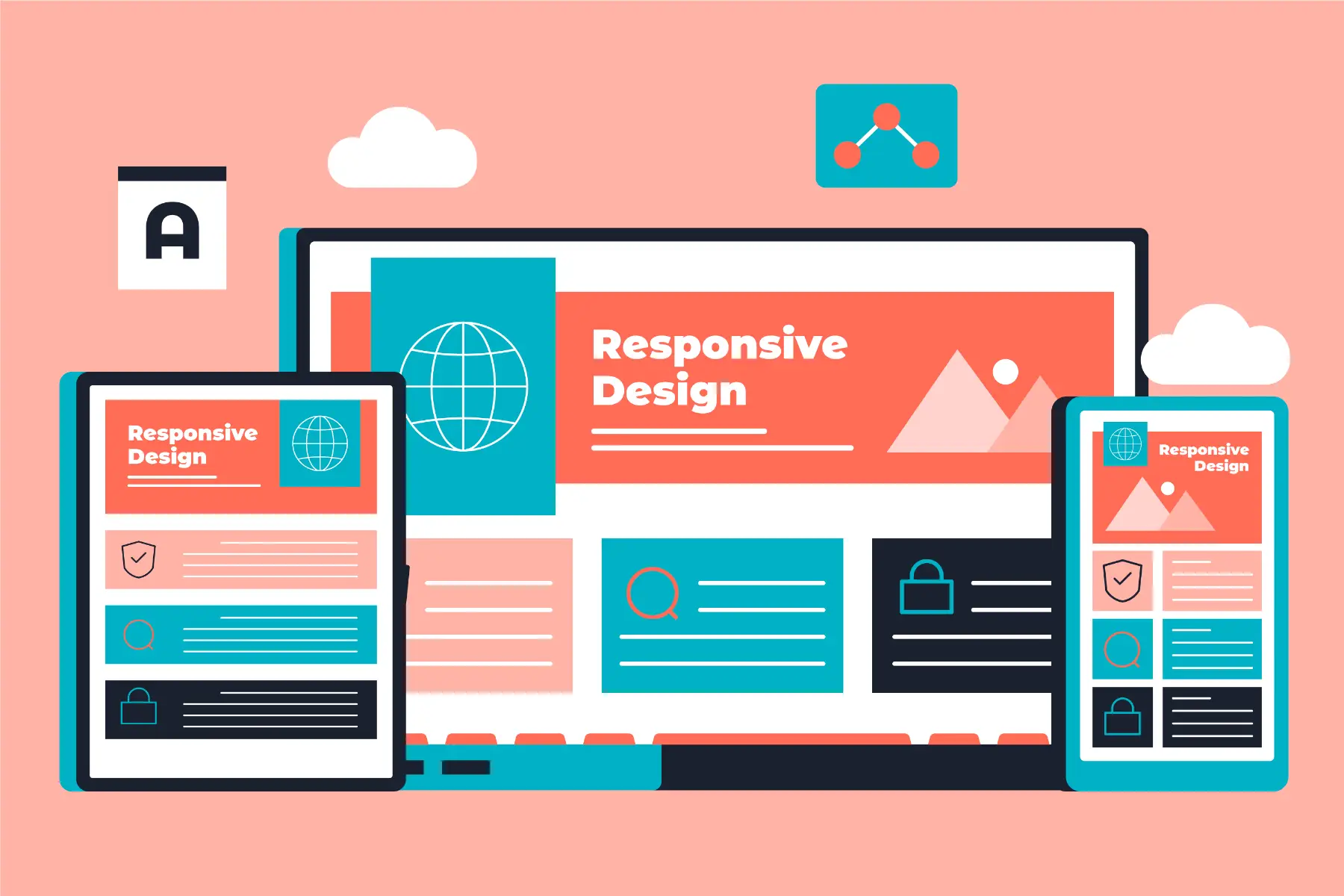
Responsive Design
With users accessing websites from countless devices, responsive design is non-negotiable. Your design must adapt seamlessly to different screen sizes while maintaining functionality and aesthetics.
Responsive design principles:
- Mobile-First Approach: Design for smallest screens first
- Flexible Grids: Use relative units and flexible layouts
- Flexible Images: Images that scale properly
- Touch-Friendly: Appropriate touch targets and gestures
- Performance: Optimize for mobile network conditions
User Feedback and Interaction
Effective UI/UX design provides clear feedback for every user interaction. Users should always know what's happening and whether their actions were successful.
Types of user feedback:
- Visual Feedback: Hover states, loading indicators, success messages
- Haptic Feedback: Vibrations for mobile interactions
- Audio Feedback: Sounds for important actions
- Progress Indicators: Loading bars and progress steps
- Error Messages: Clear, helpful error communication
Implementation Guide
Step 1: Research and Planning
Before diving into design, conduct thorough research:
- Analyze your target audience and their needs
- Study competitors and industry best practices
- Define clear user personas and journeys
- Set measurable UX goals and KPIs
Step 2: Wireframing and Prototyping
Create low-fidelity wireframes to focus on structure and functionality:
- Start with basic layout and information architecture
- Test wireframes with real users early
- Iterate based on feedback before adding visual details
- Create interactive prototypes for complex interactions
Step 3: Visual Design
Apply visual principles to create the final look:
- Develop a consistent color palette and typography
- Create a design system with reusable components
- Ensure proper contrast and readability
- Design for different states (hover, active, disabled)
Step 4: Testing and Iteration
Continuous testing is crucial for UI/UX success:
- Conduct usability testing with real users
- Perform accessibility audits and testing
- Test on various devices and browsers
- Collect and analyze user feedback
- Iterate based on data and insights
Conclusion
Mastering these UI/UX principles is essential for creating successful web designs in 2025. Remember that good design is invisible—it works so well that users don't have to think about it. Focus on understanding your users, maintaining consistency, ensuring accessibility, and providing clear feedback.
The most successful websites are those that put users first, solve real problems, and create delightful experiences. By applying these principles consistently, you'll create designs that not only look beautiful but also drive business results.
Final Thought: Great UI/UX design is not about following trends—it's about understanding human psychology and creating interfaces that work naturally with how people think and behave.